Lockpick Animations, Car Artpass, New Cop
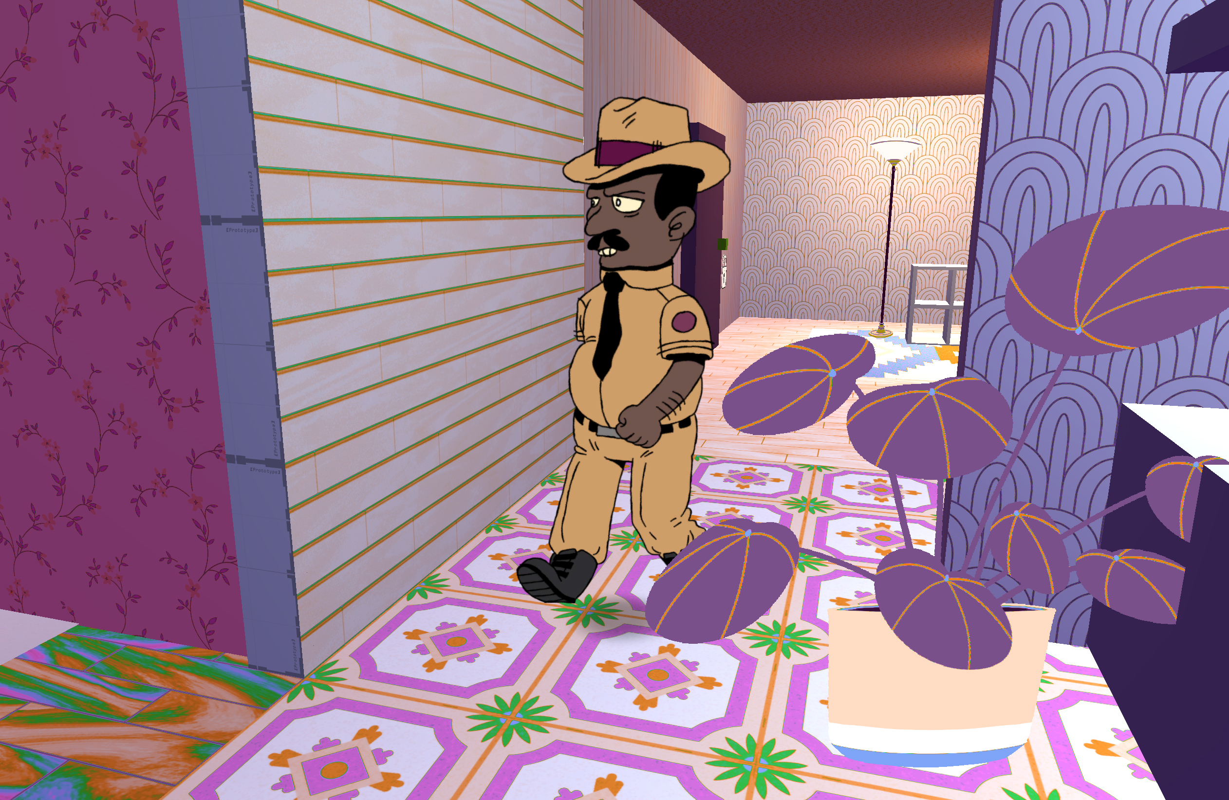 Heya folks! Been a minute. Went on a week break and we've been hard at work at nailing down just what the 3D artstyle of The Neighbors actually is, beyond the 2D art you see around the levels and menus.
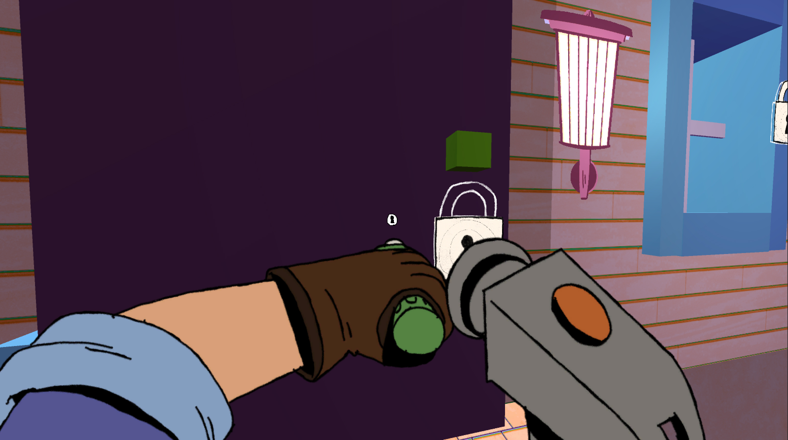
This update adds a few new visuals to The Neighbors, which I'll dig into the making of below:
- Car now is fully artpassed - retopologized to fix ugly lighting, textured, and decal'd to bring it up to quality standards for the final game.
- Lockpicking and Wirecutting now have animations for performing the actions, so players have much better visual feedback of when they're lockpicking vs not, and so on.
- A second Cop is in the process of being added to the game (still uses some placeholder visuals from the other Cop)
- Both cops now have 3/4 rear views, and back views, so it's much easier than before to tell what direction they're pointing in.
And finally, some glamour shots of the car!
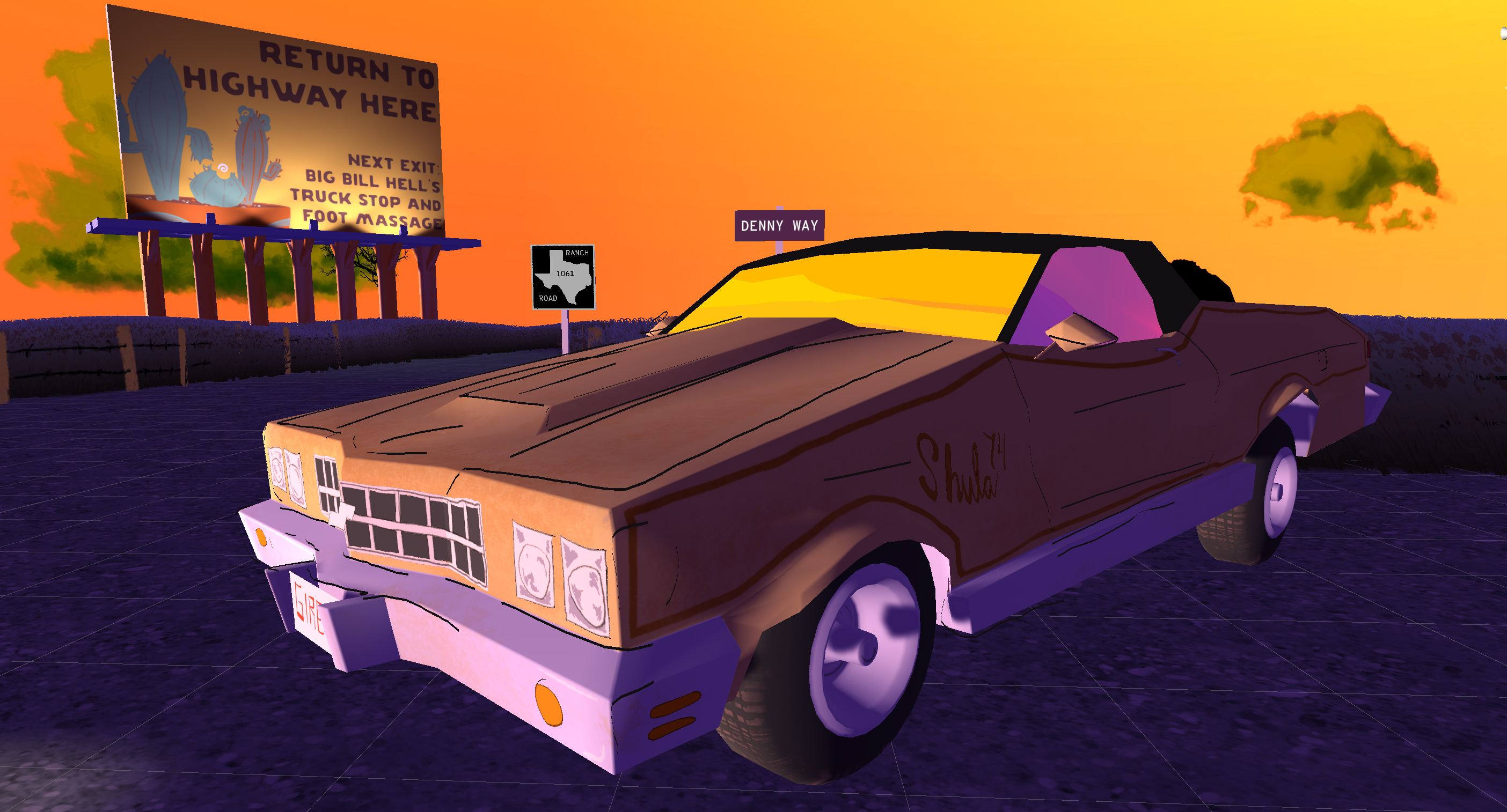
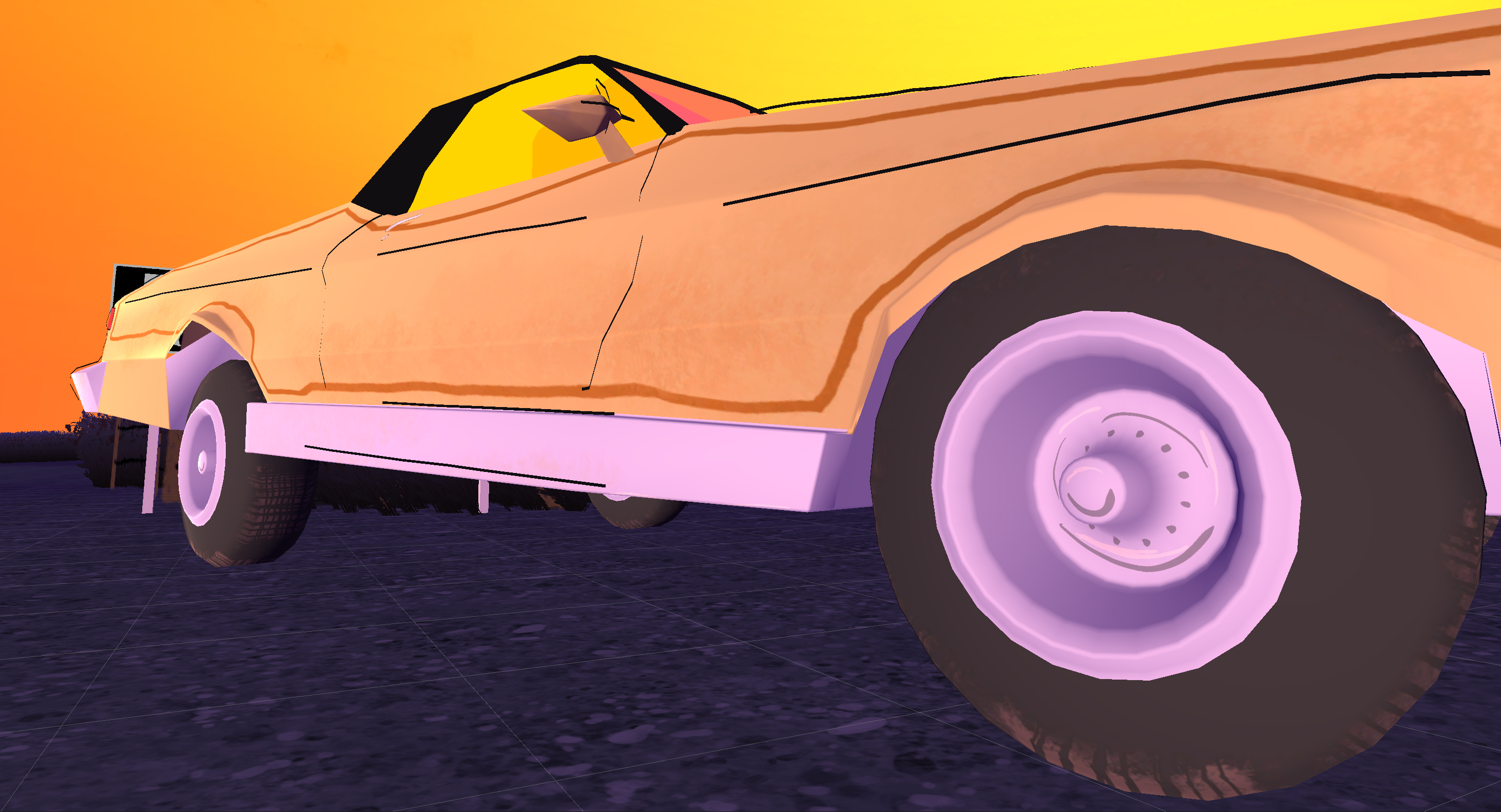
Creating the car was a lot of exploration and research to develop the process and figure out where we want to take the visual style of the game. Part of what we do best with The Neighbors is pool our collective drawing talents as a team, to create an artstyle that's unified by our handdrawn aesthetic. So for any 3D objects, we felt it was important to try and follow that.
Till now, 3D objects have been either room walls/floors, or placeholder greyboxes. Going forward, we'll be doing artpasses on existing furniture and 3D objects to match up with what we've done using the car here as the pilot example.
To get to this point, it took some interesting process and unconventional 3D design work:
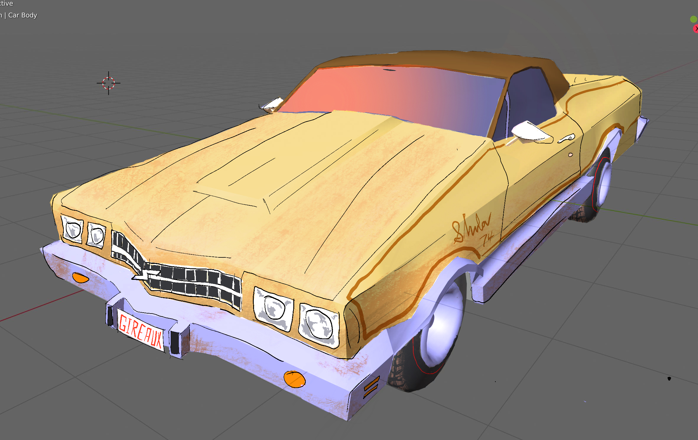
First, I took a screenshot of the existing car model from Blender and drew over it in Procreate, adding linework and surface detail as a mock of how I wanted the final car to look, approximately.
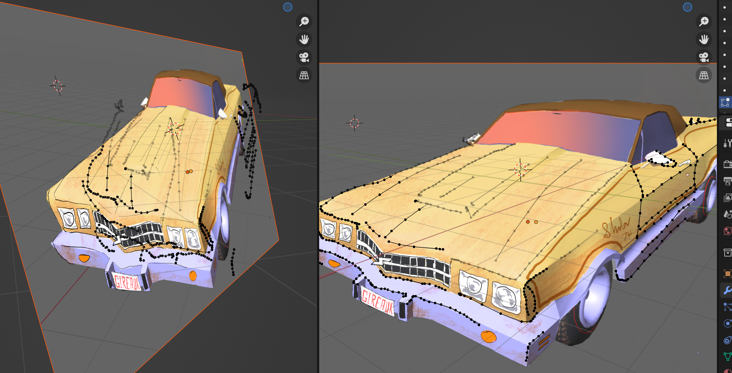
From there, I brought the artwork back into Blender as a plane and traced my linework with vertices, and took note of details like headlights and handles and license plates to make decals for those.
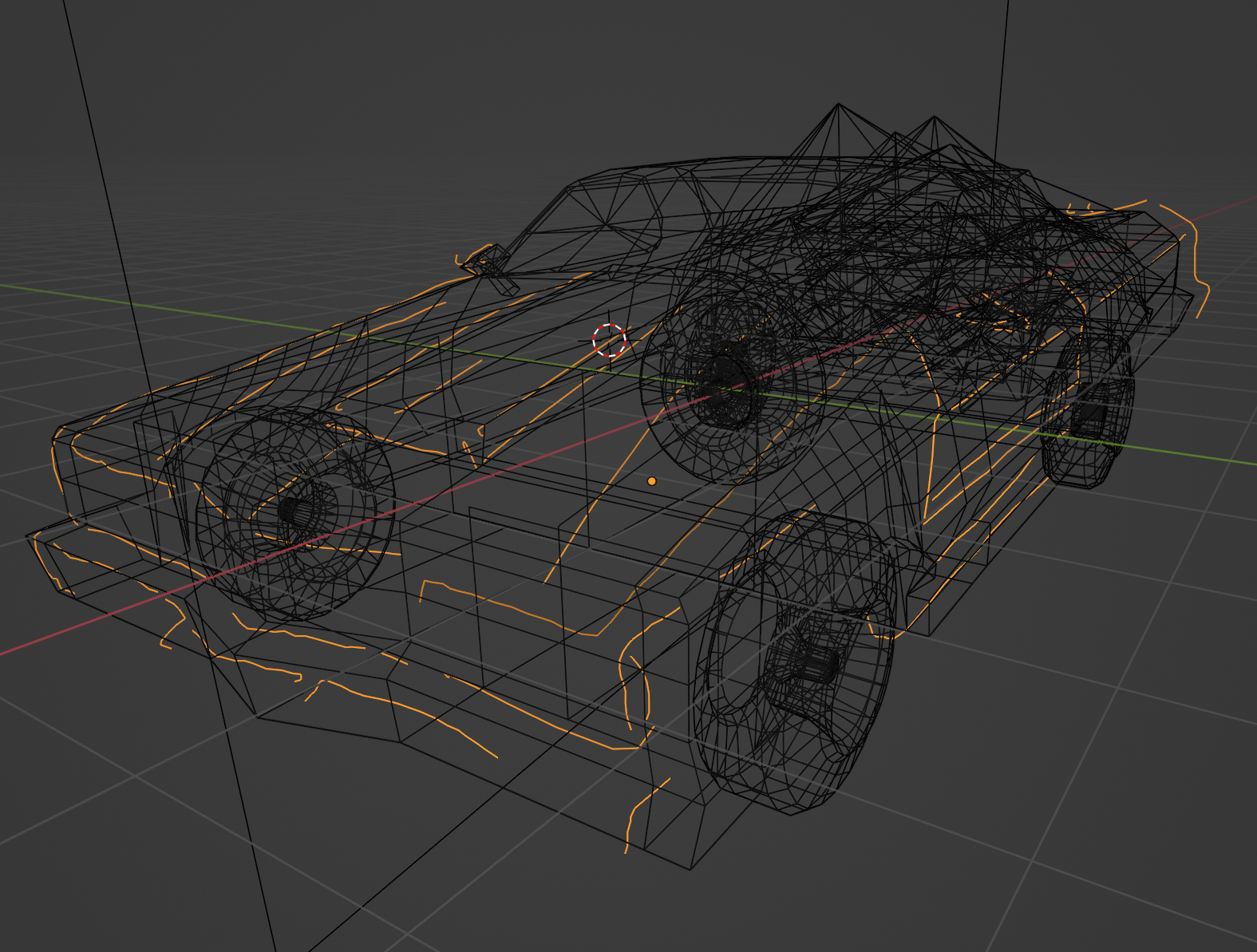
Finishing modeling the car lines resulted in a pretty close approximation of the concept art, with the same wavering and loose drawn lines that I'd drawn, rather than the perfect angles you might find in a traditional cel shader.
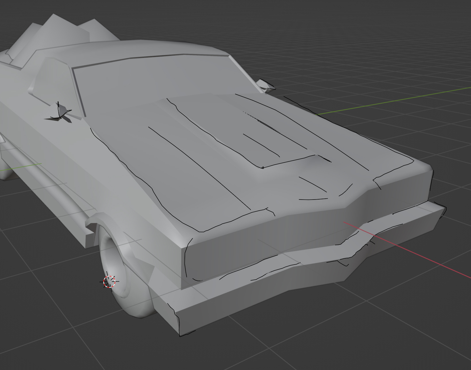
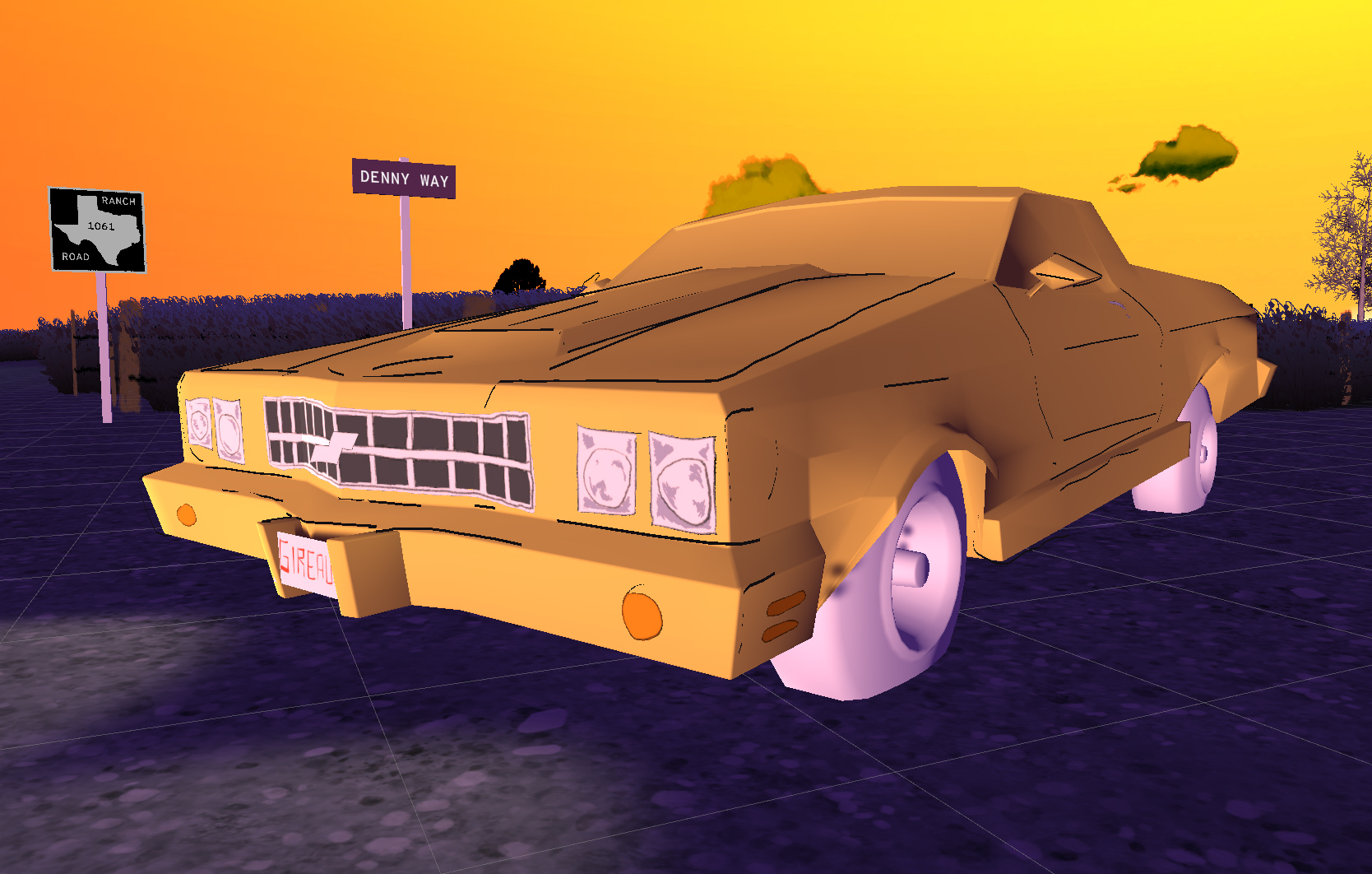
Part of this process was also retopologizing the car to better behave with lighting. Previously, if it was hit at an angle the car was pretty hideous from a lighting perspective, with lots of geometric artifacts. Getting the car geometry just right, along with adding the decals and making sure it all worked cohesively ingame was a long process to get right, since I was figuring it out as I went. The decals for the headlights and grill, as well as the texture of the car itself, were all drawn on top of the UVs exported from Blender via Procreate.
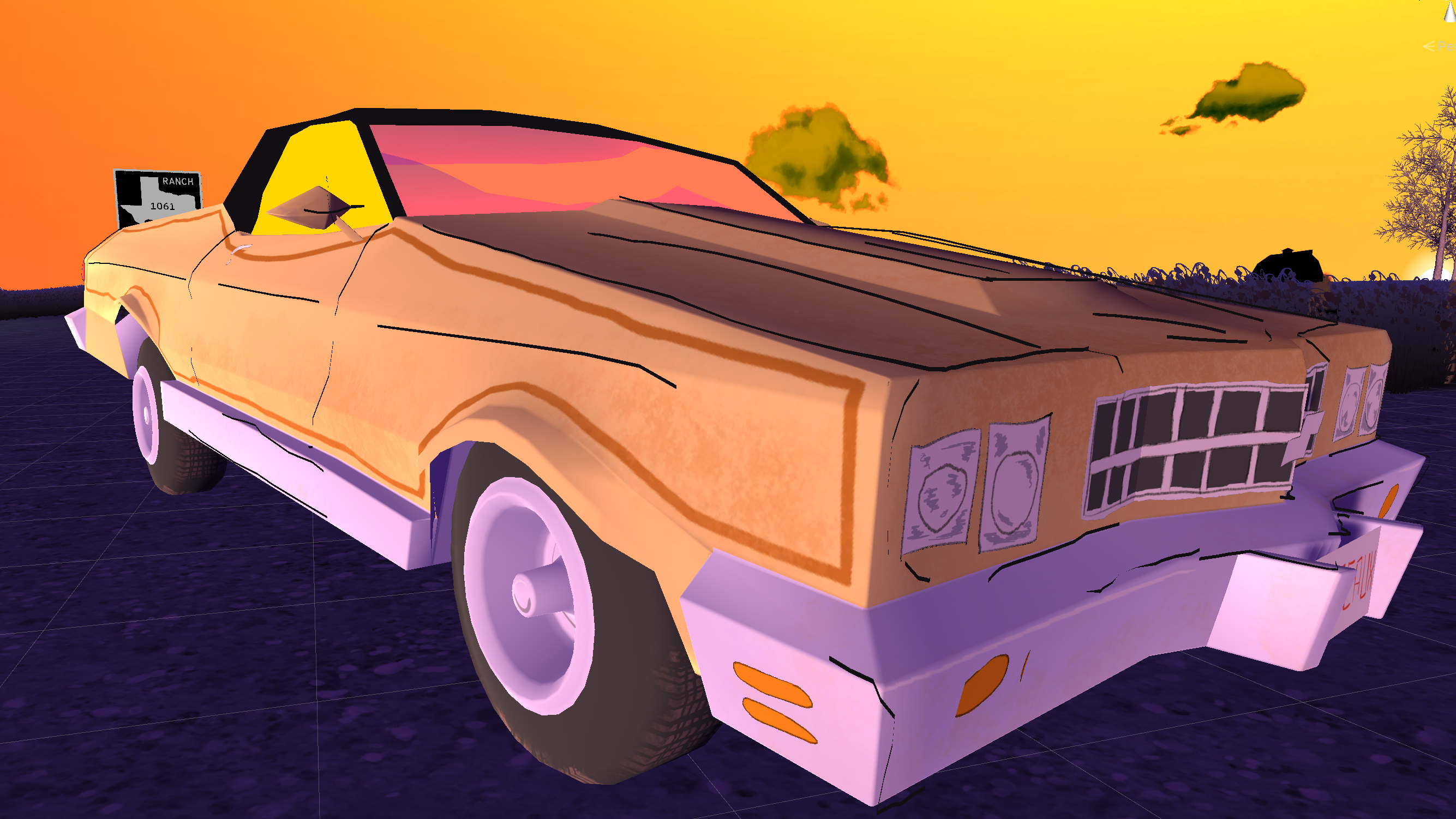
In the end, I'm extremely happy with how the car came out. My bone to pick with games like The Walking Dead or Borderlands is baking the majority of the linework into the texture or shader itself. While I think that's faster, you lose a lot of the character of linework that can make a piece feel like it was actually hand-made. The lines jumping off the model I think are an important part of that, as well as them keeping a relatively consistent shape.
Hope you enjoyed this small window into the process of how art for The Neighbors is made, and I'd hope this explains the gap between this update and the last.
-Daniel
Files
Get Keepsake County (in Beta)
Keepsake County (in Beta)
A midwestern stealth game
| Status | In development |
| Author | Forward Instinct |
| Genre | Shooter |
| Tags | 3D, Atmospheric, Cartoon, Cute, First-Person, immersive-sim, Procedural Generation, Roguelike, Singleplayer, Stealth |
| Languages | English |
| Accessibility | Configurable controls, Interactive tutorial |
More posts
- 0.69.6 - General + Tutorial HotfixesMay 25, 2024
- 0.69.6 - New Character, new Dogs, new tool, new rooms, new loot, new walls, and...May 24, 2024
- The Badlands Return for Endless Replayability Fest (0.69.5)May 13, 2024
- Welcome to The Ozarks (0.69.4)Apr 09, 2024
- 0.69.3 - Demo Added, Tutorial + Bag BugfixesDec 21, 2023
- Keepsake County won at Dreamhack!Dec 20, 2023
- Dreamhack Atlanta Patch (We're gonna be there!)Dec 11, 2023
- Beta 0.69 for SXSW Sydney Games Showcase! (Oct. 18 - 22)Sep 13, 2023
- 0.68 Update - New Level, Tutorial, Controller Support, 3 Enemies, Story Updates...Jul 31, 2023
- New Level, Enemies in Exclusive Steam Stealth Fest DemoJul 24, 2023

Leave a comment
Log in with itch.io to leave a comment.